ツリー構造
2023年11月5日

みなさんこんにちは。
ケミストのWeb担当みやのです。
「Web」記事では、これまでに得たWebに関する知識を記録として残していきたいと思います。
今回は、サイトマップとかでよくある「ツリー構造」をやってみたいと思います。
「ツリー構造」「tree structure」で検索しても斜めに枝分かれしたやつしか出てこないので、こういうカクカクした枝分かれ図のことを本当は何ていうのかはわかりません。
シンプルなやつ
参考:chibashi's note|CSSだけでツリー構造を表現する
以下のCSSを記述します。
.tree ul {
  list-style-type: none;
  margin: 0 0 0 15px;
  padding: 0;
  position: relative;
}
.tree ul li {
  position: relative;
  margin: 0;
  padding: 7px 20px;
}
.tree ul li:before {
  content: "";
  display: block;
  position: absolute;
  top: 18px;
  left: 0;
  width: 13px;
  height: 0;
  border-top: 1px solid #666;
}
.tree ul li:after {
  content: "";
  display: block;
  position: absolute;
  top: 0;
  bottom: 0;
  left: 0;
  width: 0;
  height: 100%;
  border-left: 1px solid #666;
}
.tree ul li:last-child:after {
  height: 18px;
}
.tree > ul > li:before, .tree > ul > li:after {
  border: none;
}
.tree i {
  margin-right: 8px;
}
HTMLは以下の通りです。
<div class="tree">
  <ul>
    <li>まほう
      <ul>
        <li>くろまほう</li>
        <li>しろまほう</li>
        <li>じくう</li>
      </ul>
    </li>
  </ul>
</div>- まほう
- くろまほう
- しろまほう
- じくう
<li>と</li>の間に<ul><li></li></ul>を入れるとさらに枝分かれできます。
<div class="tree">
  <ul>
    <li>まほう
      <ul>
        <li>くろまほう
          <ul>
            <li>ファイア</li>
            <li>ブリザド</li>
            <li>サンダー</li>
          </ul>
        </li>
        <li>しろまほう
          <ul>
            <li>ケアル</li>
            <li>エスナ</li>
            <li>レイズ</li>
          </ul>
        </li>
        <li>じくう
          <ul>
            <li>スロウ</li>
            <li>ヘイスト</li>
            <li>ストップ</li>
          </ul>
        </li>
      </ul>
    </li>
  </ul>
</div>- まほう
- くろまほう
- ファイア
- ブリザド
- サンダー
- しろまほう
- ケアル
- エスナ
- レイズ
- じくう
- スロウ
- ヘイスト
- ストップ
- くろまほう
開閉するやつ
参考:I am Kate Rose Morley|Tree views in css
以下のCSSを記述します。
.tree2 {
  --spacing : 1.5rem;
  --radius : 10px;
}
.tree2 li {
  display : block;
  position : relative;
  padding-left : calc(2 * var(--spacing) - var(--radius) - 2px);
}
.tree2 ul {
  margin-left : calc(var(--radius) - var(--spacing));
  padding-left : 0;
}
.tree2 ul li {
  border-left : 2px solid #ddd;
}
.tree2 ul li:last-child {
  border-color : transparent;
}
.tree2 ul li::before {
  content : '';
  display : block;
  position : absolute;
  top : calc(var(--spacing) / -2);
  left : -2px;
  width : calc(var(--spacing) + 2px);
  height : calc(var(--spacing) + 1px);
  border : solid #ddd;
  border-width : 0 0 2px 2px;
}
.tree2 summary {
  display : block;
  cursor : pointer;
}
.tree2 summary::marker, .tree2 summary::-webkit-details-marker {
  display : none;
}
.tree2 summary:focus {
  outline : none;
}
.tree2 summary:focus-visible {
  outline : 1px dotted #000;
}
.tree2 li::after, .tree2 summary::before {
  content : '';
  display : block;
  position : absolute;
  top : calc(var(--spacing) / 2 - var(--radius));
  left : calc(var(--spacing) - var(--radius) - 1px);
  width : calc(2 * var(--radius));
  height : calc(2 * var(--radius));
  border-radius : 50%;
  background : #ddd;
}
.tree2 summary::before {
  content : '+';
  z-index : 1;
  background : #696;
  color : #fff;
  line-height : calc(2 * var(--radius) - 2px);
  text-align : center;
}
.tree2 details[open] > summary::before {
  content : '−';
}
HTMLは以下の通りです。
<details>とか<summary>とか、見たことないタグが出てきました。
<ul class="tree2">
  <li>
    <details open>
      <summary>じゅもん</summary>
      <ul>
        <li>
          <details>
            <summary>火炎</summary>
            <ul>
              <li>メラ</li>
              <li>メラミ</li>
              <li>メラゾーマ</li>
            </ul>
          </details>
        </li>
        <li>
          <details>
            <summary>閃光</summary>
            <ul>
              <li>ギラ</li>
              <li>ベギラマ</li>
              <li>ベギラゴン</li>
            </ul>
          </details>
        </li>
        ・
        ・
        ・
        <li>
          <details>
            <summary>電撃</summary>
            <ul>
              <li>ライデイン</li>
              <li>ギガデイン</li>
              <li>ミナデイン</li>
            </ul>
          </details>
        </li>
      </ul>
    </details>
  </li>
</ul>-
じゅもん
-
火炎
- メラ
- メラミ
- メラゾーマ
- 余のメラ
- カイザーフェニックス
-
閃光
- ギラ
- ベギラマ
- ベギラゴン
-
爆発
- イオ
- イオラ
- イオナズン
-
冷気
- ヒャド
- ヒャダルコ
- ヒャダイン
- マヒャド
-
真空
- バギ
- バギマ
- バギクロス
-
電撃
- ライデイン
- ギガデイン
- ミナデイン
-
これで完成!でもいいんですが、jsを使ってアニメーションさせてみようと思います。
参考:ICS MEDIA|detailsとsummaryタグで作るアコーディオンUI-アニメーションのより良い実装方法
さっきのHTMLに追記します。
<details>にjs-details、<summary>にjs-summaryというクラスを追加し、<ul><li></li></ul>を<div class="content js-content"><div class="content_inner">と</div></div>で囲います。
<ul class="tree2">
  <li>
    <details class="js-details" open>
      <summary class="js-summary">めがてん</summary>
      <div class="content js-content">
        <div class="content_inner">
          <ul>
            <li>
              <details class="js-details">
                <summary class="js-summary">火炎系</summary>
                <div class="content js-content">
                  <div class="content_inner">
                    <ul>
                      <li>アギ</li>
                      <li>アギラオ</li>
                      <li>アギダイン</li>
                    </ul>
                  </div>
                </div>
              </details>
            </li>
            ・
            ・
            ・
          </ul>
        </div>
      </div>
    </details>
  </li>
</ul>
以下のスクリプトを記述します。
document.addEventListener("DOMContentLoaded", () => {
  setUpAccordion();
});
const setUpAccordion = () => {
  const details = document.querySelectorAll(".js-details");
  const RUNNING_VALUE = "running";
  const IS_OPENED_CLASS = "is-opened";
  details.forEach((element) => {
    const summary = element.querySelector(".js-summary");
    const content = element.querySelector(".js-content");
    summary.addEventListener("click", (event) => {
      event.preventDefault();
      if (element.dataset.animStatus === RUNNING_VALUE) {
        return;
      }
      if (element.open) {
        element.classList.toggle(IS_OPENED_CLASS);
        const closingAnim = content.animate(closingAnimKeyframes(content), animTiming);
        element.dataset.animStatus = RUNNING_VALUE;
        closingAnim.onfinish = () => {
          element.removeAttribute("open");
          element.dataset.animStatus = "";
        };
      } else {
        element.setAttribute("open", "true");
        element.classList.toggle(IS_OPENED_CLASS);
        const openingAnim = content.animate(openingAnimKeyframes(content), animTiming);
        element.dataset.animStatus = RUNNING_VALUE;
        openingAnim.onfinish = () => {
          element.dataset.animStatus = "";
        };
      }
    });
  });
}
const animTiming = {
  duration: 400,
  easing: "ease-out"
};
const closingAnimKeyframes = (content) => [
  {
    height: content.offsetHeight + 'px',
    opacity: 1,
  }, {
    height: 0,
    opacity: 0,
  }
];
const openingAnimKeyframes = (content) => [
  {
    height: 0,
    opacity: 0,
  }, {
    height: content.offsetHeight + 'px',
    opacity: 1,
  }
];-
めがてん
-
火炎系
- アギ
- アギラオ
- アギダイン
-
氷結系
- ブフ
- ブフーラ
- ブフダイン
-
電撃系
- ジオ
- ジオンガ
- ジオダイン
-
衝撃系
- ザン
- ザンマ
- ザンダイン
-
万能系
- メギド
- メギドラ
- メギドラオン
-
まとめ
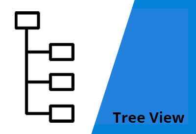
ググったらこういう画像が見つかったので、tree viewっていうのが正しいのかもしれません。
これを使って薬の記事を書こうと思います!何の薬にしようかな~